A service landing page has a specific job: help a relevant visitor understand the offer, decide whether it suits their situation and take the next step. Attractive design supports that decision, but cannot compensate for a vague service explanation or an enquiry process that asks the wrong questions.
I plan the page around the visitor’s decision sequence. The layout, copy, proof and form should each answer a question that matters before contact.
Match the first view to the reason for the visit
Check the campaign or search intent bringing people to the page. Someone searching for a specialist audit needs a different explanation from someone comparing general accounting services. A visitor considering wisdom-tooth treatment has different concerns from a patient booking a routine check-up.
The first view should name the relevant service, state who it is for and provide one understandable next step. Avoid opening with a broad claim that could apply to any business. Give the visitor enough context to recognise that they have reached the right page.
Explain the service in the customer’s terms
Translate service features into useful decision information. What is included? What circumstances does it address? What should the visitor prepare? What happens after an enquiry? If cost depends on scope, explain the factors rather than hiding the subject completely.
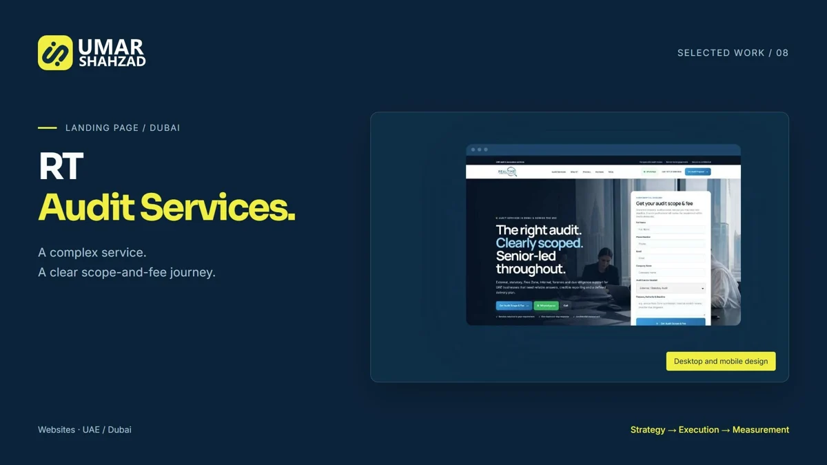
The RT Audit Services landing page organised six services around different requirements and used a scope-and-fee enquiry. That structure gives prospects a route through a complex service offering.
Place proof beside the decision it supports
Credentials are more helpful near the explanation of who will do the work. Relevant project examples belong beside the service or outcome they demonstrate. Reviews should be authentic and clearly attributed. A long wall of generic testimonials can make a page longer without resolving the visitor’s main concern.
For the Perth Wisdom Teeth project, practitioner information, treatment process, cost and location supported the consultation journey. Those elements answered practical questions rather than serving as decoration.
Make the form appropriate to the conversation
Collect enough information for a useful response. Ask for details the team needs to understand the requirement, and explain why an unusual field is necessary. Do not make the visitor complete an internal discovery document before they have spoken to anyone.
Test labels, validation messages, success feedback and delivery to the team. A visually polished form is incomplete if an error is unclear or the enquiry is not received. Check that the next step after submission matches what the page promised.
Review the mobile page as a complete journey
Read the page on a narrow screen from first view to form submission. Check whether the service remains clear, the proof appears at the right point and the primary action is easy to find. Test actual controls with a keyboard as well as touch.
- Can the visitor identify the service without scrolling through a large decorative hero?
- Do headings describe the content beneath them?
- Are images readable and relevant at mobile size?
- Do form errors explain how to correct the input?
Improve the decision, then measure the response
Record the baseline for relevant visits, successful submissions and suitable enquiries. Change the main obstacle deliberately. For low-traffic sites, structured enquiry review and usability feedback may be more informative than rushing into an underpowered split test.
The finished page should make the buying decision easier and produce a useful conversation for the team. Pair it with reliable conversion measurement so improvements can be assessed properly.